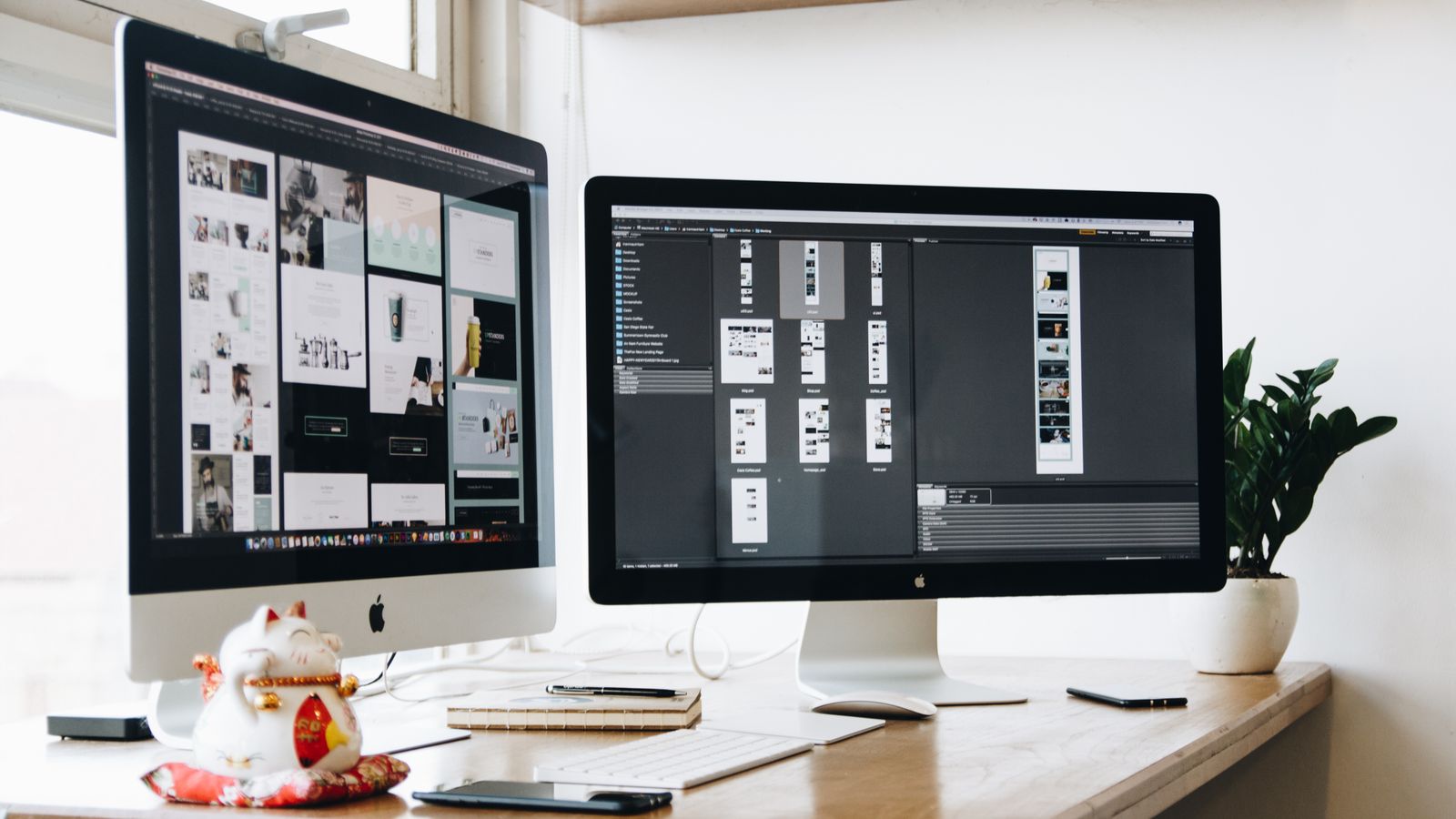
A client hands you a beautiful 40-page InDesign brochure — a polished .indd file, every kern and column exactly where the print designer wanted it — and says, "make the website look exactly like this." If you have done any front-end work for design-led teams, your stomach drops a little, because you already know the truth nobody put in the brief: there is no button that turns this into a website. Export to HTML gets you a pile of absolutely-positioned divs and inline styles that collapse the moment someone opens it on a phone.
I build sites and apps for small businesses, and a real chunk of that work is taking something made for paper and re-authoring it for the web. This post is the honest, in-the-trenches version of that pipeline: how to turn a print-first InDesign file into a token-driven, responsive, tested React app — and, just as importantly, an honest map of where the manual work actually lives. It is the same disciplined pipeline we run on every build (lock the tokens, write the tests first, diff against the design), just pointed at a source that was never meant for the web.
You are not converting the file. You are re-authoring its intent. The .indd is the spec, not the source of truth.
Why InDesign Is Not Figma (The Core Problem)
Most "design to code" content quietly assumes you are starting in Figma — a tool built for screens, with components, auto-layout, breakpoints, and a structure that maps to the DOM. InDesign has none of that DNA. It is print-first to the bone: pages and spreads, measurements in picas and points, color in CMYK and Pantone, and elements pinned to absolute X/Y coordinates on a fixed canvas. There is no concept of a component, no auto-layout, no breakpoints, and no DOM.
- Text frames are not semantic HTML. The one real gift InDesign gives you is paragraph and character styles — they map cleanly to a type scale if you bother to read them.
- Color is CMYK or Pantone, built for ink, not an sRGB screen. Every brand color needs a deliberate conversion, and that conversion is lossy.
- Assets are linked or embedded at print DPI (300), not the 72/2x you want for web, and the fonts may be licensed for print but not web embedding.
- The page is finite and fixed. The web is fluid and infinite in one direction. Nothing about the .indd anticipates a 375px-wide phone.
So the takeaway that should govern the whole job: you are not "converting" anything. You are re-authoring intent for a completely different medium. The file tells you what the designer wanted; it does not tell you how the web should behave. Treat it as a detailed spec, not a source of truth you can mechanically transform.
Step 0 — Audit and Decisions Before You Write Any Code
The most expensive mistake here is opening your editor too early. Before a single component, do an audit. Inventory every page and look for what repeats: the hero, the pull-quote, the card grid, the gallery — those are your components. Then find the genuine one-offs that only appear once and do not deserve their own abstraction. For each repeated module, decide deliberately whether it becomes a real component or a one-off CMS block.
Then hold a short "responsive intent" conversation — even if it is just with yourself. Print has infinite vertical space and a fixed width; the web has the opposite. So decide, up front, what reflows, what stacks, and what simply gets cut on mobile because it was a print flourish that does not earn its keep on a small screen. Define your breakpoint set before you build, mobile-first, so every later decision has a frame to sit in.
Step 1 — Extract Design Tokens From the .indd
This is the step that turns a static file into a system. Open the InDesign paragraph and character styles and pull them into a typography scale: font family, the print font size, leading mapped to line-height, and tracking mapped to letter-spacing. Convert the units as you go — points to rem against a 16px base, picas to pixels, and leading to a unitless line-height. For color, convert each CMYK or Pantone value to an sRGB hex, and be honest in your notes that this is lossy and needs an eyeball QA pass against the brand, because ink and light do not agree on what "red" means.
The output of this step is a single tokens.json — your colors, spacing scale, type scale, and radii in one place — that feeds straight into your Tailwind config. Here is the shape of it:
json{
  "color": {
    "brand": { "navy": "#1B2A4A", "gold": "#C8A24B", "paper": "#F7F4EC" },
    "ink": { "900": "#14181F", "600": "#4A4A4A" }
  },
  "font": {
    "family": { "display": "\"Canela\", Georgia, serif", "body": "\"Inter\", system-ui, sans-serif" },
    "size": { "base": "1rem", "h2": "1.875rem", "display": "3rem" },
    "leading": { "tight": 1.1, "normal": 1.5 },
    "tracking": { "tight": "-0.01em", "wide": "0.06em" }
  },
  "space": { "1": "0.25rem", "2": "0.5rem", "4": "1rem", "8": "2rem", "16": "4rem" },
  "radius": { "card": "0.75rem" }
}
Then map those tokens into the Tailwind theme so nothing downstream is allowed to invent a value:
ts// tailwind.config.ts
import tokens from "./tokens.json";

export default {
  theme: {
    extend: {
      colors: {
        navy: tokens.color.brand.navy,
        gold: tokens.color.brand.gold,
        paper: tokens.color.brand.paper,
      },
      fontFamily: {
        display: ["Canela", "Georgia", "serif"],
        body: ["Inter", "system-ui", "sans-serif"],
      },
      borderRadius: { card: tokens.radius.card },
    },
  },
};
This is the "token lock" step. Once these values are locked, no component is allowed to ship a hardcoded hex or a random margin. Every color and every spacing decision has to come from the scale, which is exactly what keeps a 40-page rebuild visually consistent instead of slowly drifting page by page.
Step 2 — Map the Layout to a Responsive System
With tokens locked, the next job is killing absolute positioning. InDesign places everything at fixed coordinates; the web needs flow. Translate the print grid into CSS Grid and Flexbox with container queries where it helps. InDesign's layout grid — its margins, columns, and gutters — becomes a real 12-column responsive grid, and the elements snap to it instead of to pixel coordinates.
Two problems show up here every single time. The first is the "infinite page" problem: a long print flow has to be sectionized into stacked web sections that each own their own vertical rhythm, rather than one endless canvas. The second is image handling — export at 2x, reach for modern formats like WebP and AVIF, and use responsive srcset so a portrait phone is not downloading a print-resolution monster. Some crops simply do not survive the trip to a narrow screen, so plan art-direction alternates for those rather than letting the browser squash them.
Step 3 — Build the Components, Tests First
Now, and only now, do you write components — and you write the test before the component, every time. From the audit you already know the library: a Hero, a PullQuote, a FigureWithCaption, a CardGrid, a CTASection. Take the PullQuote, since this very post uses one. The failing test comes first, describing the props, the rendered content, and the accessibility role, and that test gates the build. Here is the test:
tsximport { render, screen } from "@testing-library/react";
import { describe, it, expect } from "vitest";
import { PullQuote } from "./PullQuote";

describe("PullQuote", () => {
  it("renders the quote text", () => {
    render(<PullQuote quote="The file is the spec, not the source of truth." />);
    expect(
      screen.getByText(/the file is the spec/i)
    ).toBeInTheDocument();
  });

  it("renders an attribution inside a <cite> when provided", () => {
    render(<PullQuote quote="Re-author the intent." cite="Paul Mulligan" />);
    const cite = screen.getByText("Paul Mulligan");
    expect(cite.tagName.toLowerCase()).toBe("cite");
  });

  it("uses a semantic blockquote for accessibility", () => {
    const { container } = render(<PullQuote quote="Locked tokens, no drift." />);
    expect(container.querySelector("blockquote")).not.toBeNull();
  });
});
Only after that test is red do you write the component that turns it green. Note the semantics: a real blockquote and cite, not a styled div pretending to be a quote, because the markup is what a screen reader actually announces.
tsxinterface PullQuoteProps {
  quote: string;
  cite?: string;
}

export function PullQuote({ quote, cite }: PullQuoteProps) {
  return (
    <blockquote className="my-10 border-l-4 border-gold pl-6 font-display text-2xl leading-tight text-navy">
      <p>{quote}</p>
      {cite && (
        <cite className="mt-3 block text-base not-italic text-ink-600">
          — {cite}
        </cite>
      )}
    </blockquote>
  );
}
Accessibility is not a final coat of paint here; it is built into this step. Print designers think in visual weight, so a line set in 48pt type is "a heading" to them — but visual size is not an h1. Re-derive the real heading order from meaning, not from font size. Add genuine alt text to every image (the print file rarely has any), and re-check color contrast on those CMYK-to-sRGB conversions, because a color that looked fine on coated stock can fail WCAG contrast on a screen. And keep content out of JSX where you can: drive components from data so the words live in content, not buried in markup, which is exactly the model this very blog is built on.
Where the Manual Work Actually Lives
If you take one practical thing from this, let it be honesty about the hard parts. The export button is a myth; the value is in the re-authoring. Reading paragraph styles into a type scale, converting and QA-ing color, sectioning the infinite page, art-directing the crops that do not survive mobile, and deriving a real semantic heading order — that is the work, and no tool does it for you for free. The discipline that makes it repeatable is the same one we apply everywhere at PMDS: lock the tokens, write the tests first, diff the result against the design. I wrote about that framework in depth in our post on the Aurelius Claude Code framework, and you can see the same rigor on a full product build in the Bridleway marketplace case study. The platform-specific edge cases — like the kind I documented in the Webflow Designer API alt text workaround — are exactly the spots where a careful, tested pipeline earns its keep.
If you are a design-led team sitting on a gorgeous InDesign file and wondering how it becomes a real, fast, accessible website, that is precisely the kind of work I do. Get in touch and let's talk about turning your print layout into something that works just as well on a phone as it does on paper.
Your digital website sherpa: practical web tips for small businesses, straight to your inbox
Join the Digital Website Sherpa newsletter. No spam, just practical, actionable advice to help you grow your business online. Unsubscribe anytime.
Paul Mulligan
Freelance Web Developer
Paul Mulligan is a freelance web developer based in Baltimore, MD with 10+ years of experience building WordPress and Webflow sites for small businesses. He focuses on clean design, fast performance, and real results.
Support My Open Source Work
I build free, open-source developer tools like Flavian and Aurelius. If you find my work helpful, consider supporting me on Patreon.
Support on PatreonRelated Articles
54 Specialized AI Agents Inside Aurelius: Our Claude Code App-Dev Framework
Read ArticleBuilding Bridleway: A Next.js Horse Marketplace with Escrow, Auction Aggregation, and Verified Sellers
Read ArticleWebflow Designer API: Image Alt Text Workaround
Read ArticleReady to Transform Your Business's Website?
Let's discuss how I can create a website that attracts and converts more customers.
Get a Free Consultation